Pink Zebra Copywriting

A brand with a lot of personality

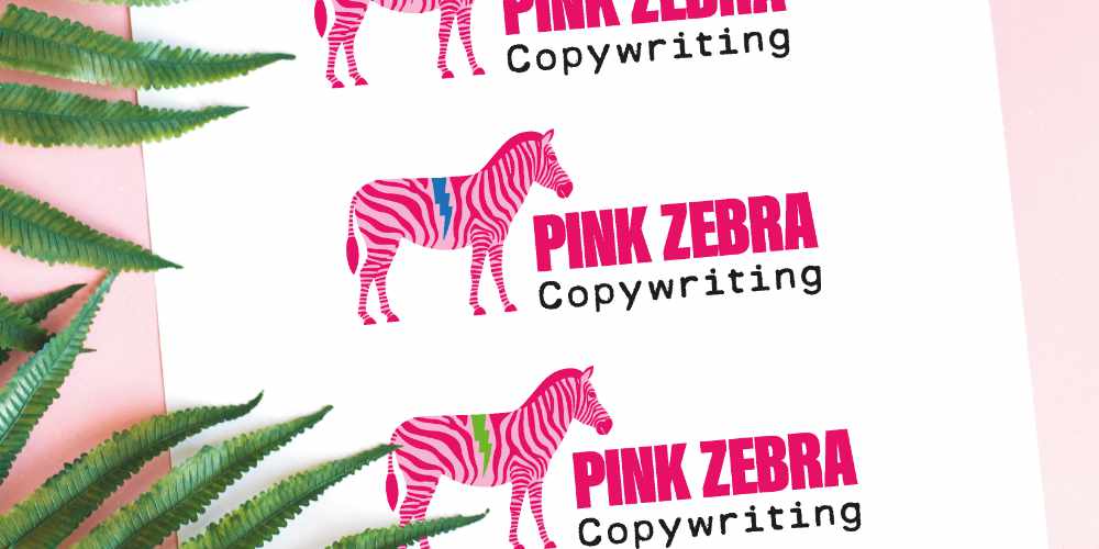
Pink Zebra Copywriting is a bold, unconventional brand with a motto that says it all: “It’s ok to be different.” Yasmin Mears approached me with a vibrant vision—she wanted something unapologetically striking, playful, and a little “clashy.” Her brief included a few key elements: bright colors, a zebra mascot, and a visual identity that would stand out in a sea of corporate sameness. She needed a full visual identity, business cards, notepads, and website.

Branding and Web Approach

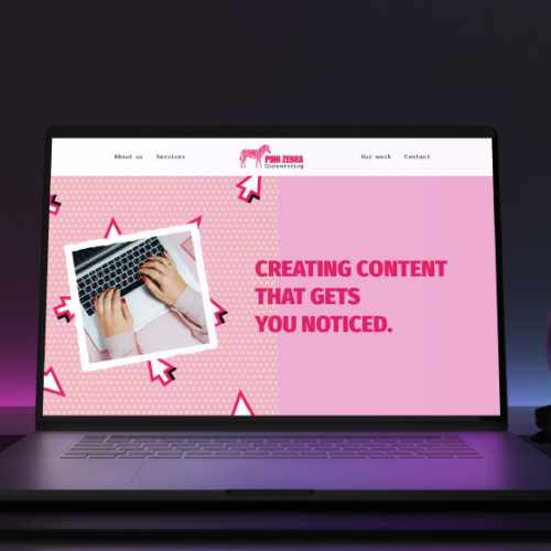
Building on her ideas, I developed a full brand experience, designing the logo, business cards, notepads, and website. The result is a lively, energetic identity that captures the brand’s disruptive spirit while remaining professional and approachable. Strong color contrasts, bold typography, and whimsical illustrations bring Pink Zebra to life, celebrating individuality at every touchpoint.

Results

The rebrand gave Pink Zebra Copywriting a bold and cohesive visual identity that matched the wit, clarity, and creativity of their tone of voice. The new branding helped the agency stand out in a saturated market and project a more professional, confident image—while still retaining its playful personality.

Testimonial

"...I'm finally able to reveal my brand new, absolutely bangin' website. A huge shout out to the team at Oxygen Elements who completely smashed the brief. I had a vision, and thanks to their creative queen Irene Torcal Cano, I'm now able to show off a website that is everything I wanted - and more."
Yasmin Mears
Managing Director